
ECIB Brand Refresh
Introduction
Expeditors Cargo Insurance Brokers, ECIB, is a wholly owned subsidiary of Expeditors and provides full-service cargo insurance brokerage and cargo claims management from experienced logistics insurance brokers.
Deliverables
- Updated logo assets
- Brand Guidelines
- Marketing and sales assets and templates
Team
- Hunter Zachwieja: Graphic Design, Art Direction
- Kash Wimer: Art Direction
- Samantha Berrios: Graphic Design
Disciplines
- Brand Design
- Brand Strategy
- Graphic Design
Duration
5 Months
Project Overview
The Problem
ECIB, along with most of the other Expeditors subsidiaries, all used the same red, black, and white color palette. This resulted in limited differentiation between the brands and confusion when they were presented to customers at meetings, trade shows, and online.
The Goal
The goal of this project was to refresh and expand ECIB’s brand, while maintaining connection to the parent company’s visuals, and design a new brochure-style website along with other marketing and sales assets to reflect those updates.
Final Designs
Brand Guidelines Document


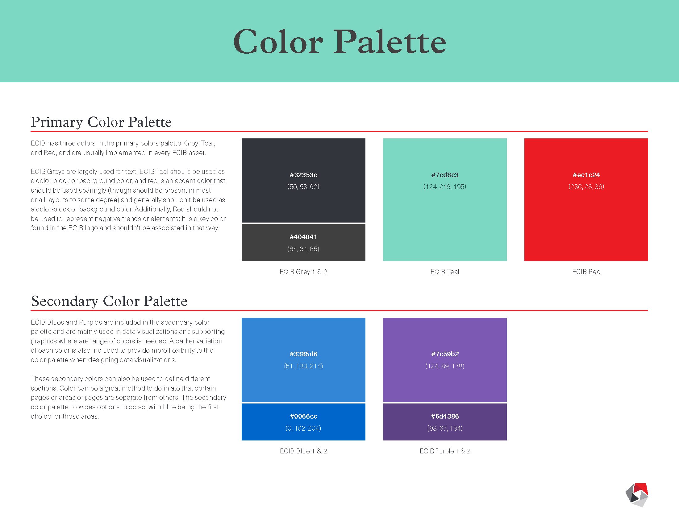


This document established a new visual language for ECIB. It acts as both a guide and a baseline to develop upon.
Sales & Marketing Asset Design

Updated Flyer Design

Social Media Posts

Updated Case Study Design

Carousel Social Media Post

Tradeshow Booth Design
Going Forward
Takeaways
The biggest things I learned from this project was how to effectively pitch ideas, present design work, and manage clients throughout the process. It’s easy for the designer, who has been living in the concepts for days or weeks, to forget that the client is coming into our presentations with fresh eyes and they need to be convinced of the design direction. I was empowered throughout this project, from initial pitch to final deliverables, to expand my involvement beyond the design and into leading the process and client presentations. This was the first time I had that role for a project of this magnitude, so I was naturally learning as I went, but I came out at the end feeling far more prepared for future efforts.
Next Steps
I’m quite pleased with the overall look of the updated assets, but a brand is not static – it evolves. With future assets, I’d like to push the designs and colors into more dynamic styles as they are now developing into. The pieces that I designed are structured and avoided trends, but there are opportunities to push into more interesting treatments and build upon the solid baseline.
For the website, the web development process left some areas lacking in finesse due to the theme that was used and the timeline for launch. Though I didn’t develop the initial website, I’d like to continue to work on refining and adjusting the site to improve consistency of the interface and streamline the user experience. Ideally, we’d be able to also invest in further user research to improve the website’s functionality beyond its basic capabilities, but that doesn’t seem likely in the near future.